Project 06Industrial Design
← All workXIANGQI - The Living Battlefield
A chess board shaped by the game it holds.
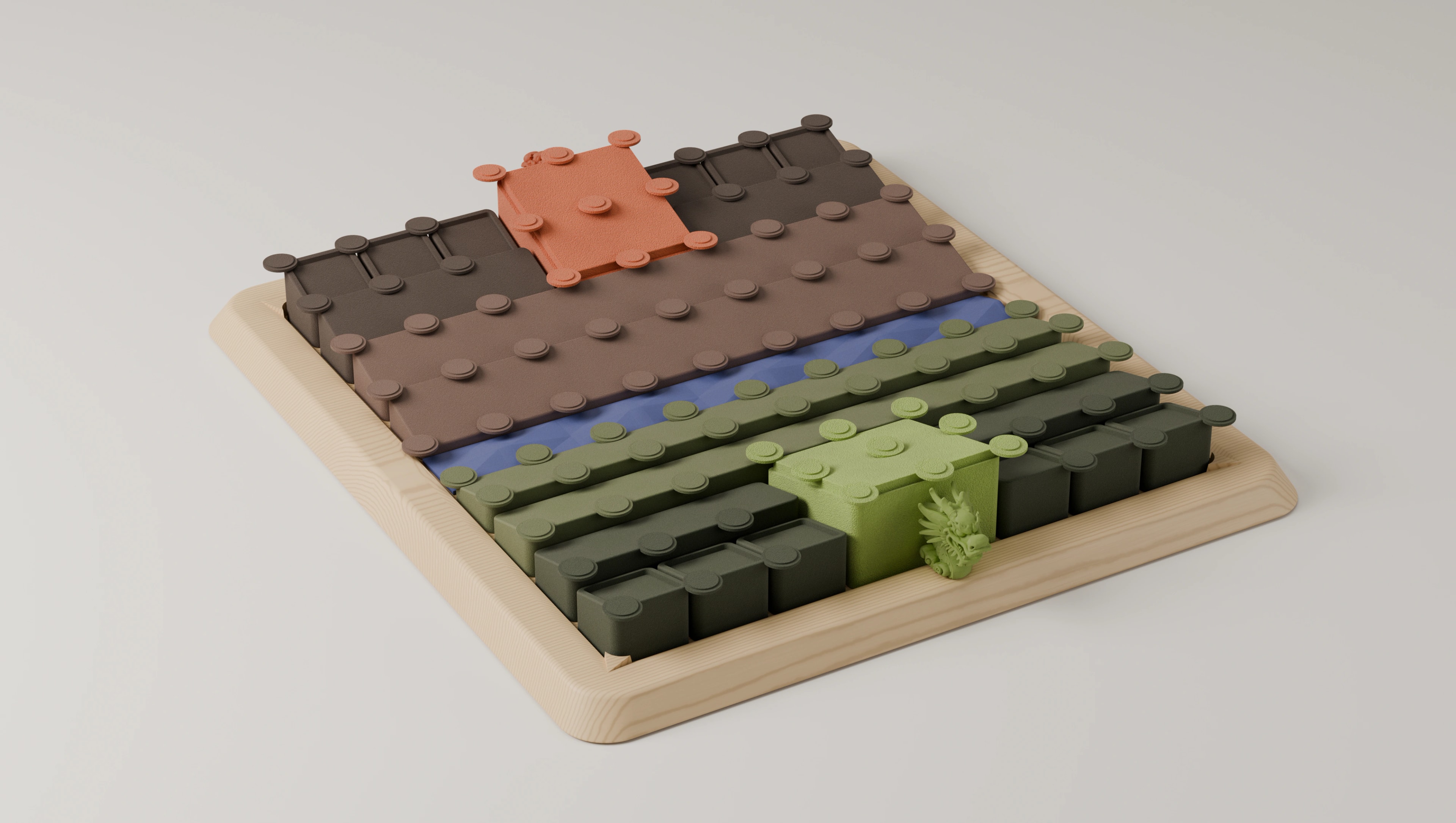
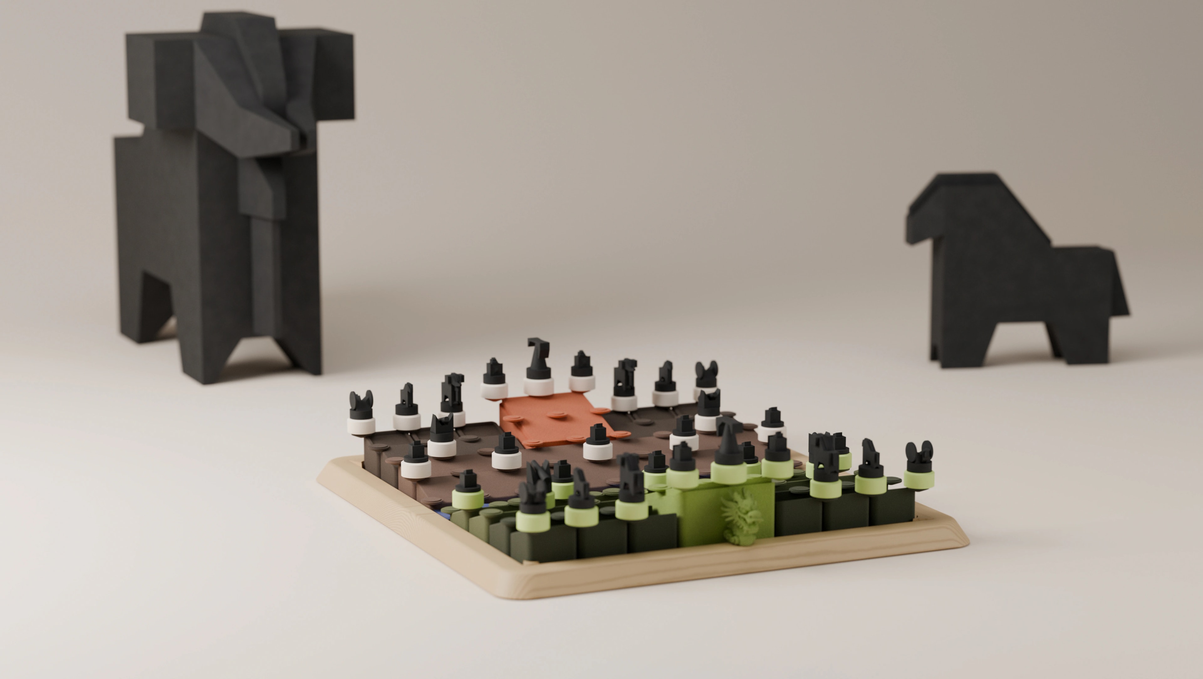
Xiangqi is usually presented on a flat field of lines. This concept asks what happens when its most recognisable spatial ideas - the opposing sides, the river and the palaces - become the physical form of the board: a pale wood frame holding two contrasting territories, a blue river between them, and raised sections giving each side its own landscape.
The ambition is a board worth looking at between games that stays clear enough to play one. What exists today is a 3D concept render and a playable digital prototype - not yet a tested or manufactured product.
- Role
- Product designer
- Year
- 2025
- Scope
- Concept development · Industrial design · Board architecture · Form exploration · CMF direction · 3D visualization · Playable 3D prototype
- Product
- Tabletop Xiangqi set
- Status
- Independent concept project
01The idea
What if the battlefield was more than a printed grid?
Xiangqi already contains a spatial story. Two sides face one another, a river cuts through the middle, and each general sits in a palace. The board tells that story with lines and symbols - while staying physically flat.
I wanted to see whether the board itself could carry more of it. Not by adding a miniature landscape around a conventional game, but by letting the game's own structure become the architecture of the playing surface.
The question
Can the river, territories and palaces become the architecture of the playing surface?
That set the brief: the product had to work at two scales - as a composed object seen from across a room, and as a precise game surface seen from a player's seat.
02Design principle
Give the game a landscape without changing its rules
The form is built entirely from three parts Xiangqi already has. The different levels and matte colours make the board feel like a small terrain model, while the repeated circular positions tie every part back to the game.
Game structure, as product architecture
Game structure
Product expression
- 01
Game structure: Opposing sides
Product expression: Two tonal territories with different visual weight
- 02
Game structure: River
Product expression: A blue recessed band through the centre
- 03
Game structure: Palaces
Product expression: Raised focal areas within each territory
But Xiangqi is played on the intersections of nine vertical and ten horizontal lines, with a palace on each side and a river between them. A sculptural interpretation has to preserve that network - colour and height can't quietly redefine legal positions. That constraint is what the concept gets prototyped against.
Core principle
Make the game's structure tangible, while keeping its interaction familiar.
03Form
From diagram to terrain
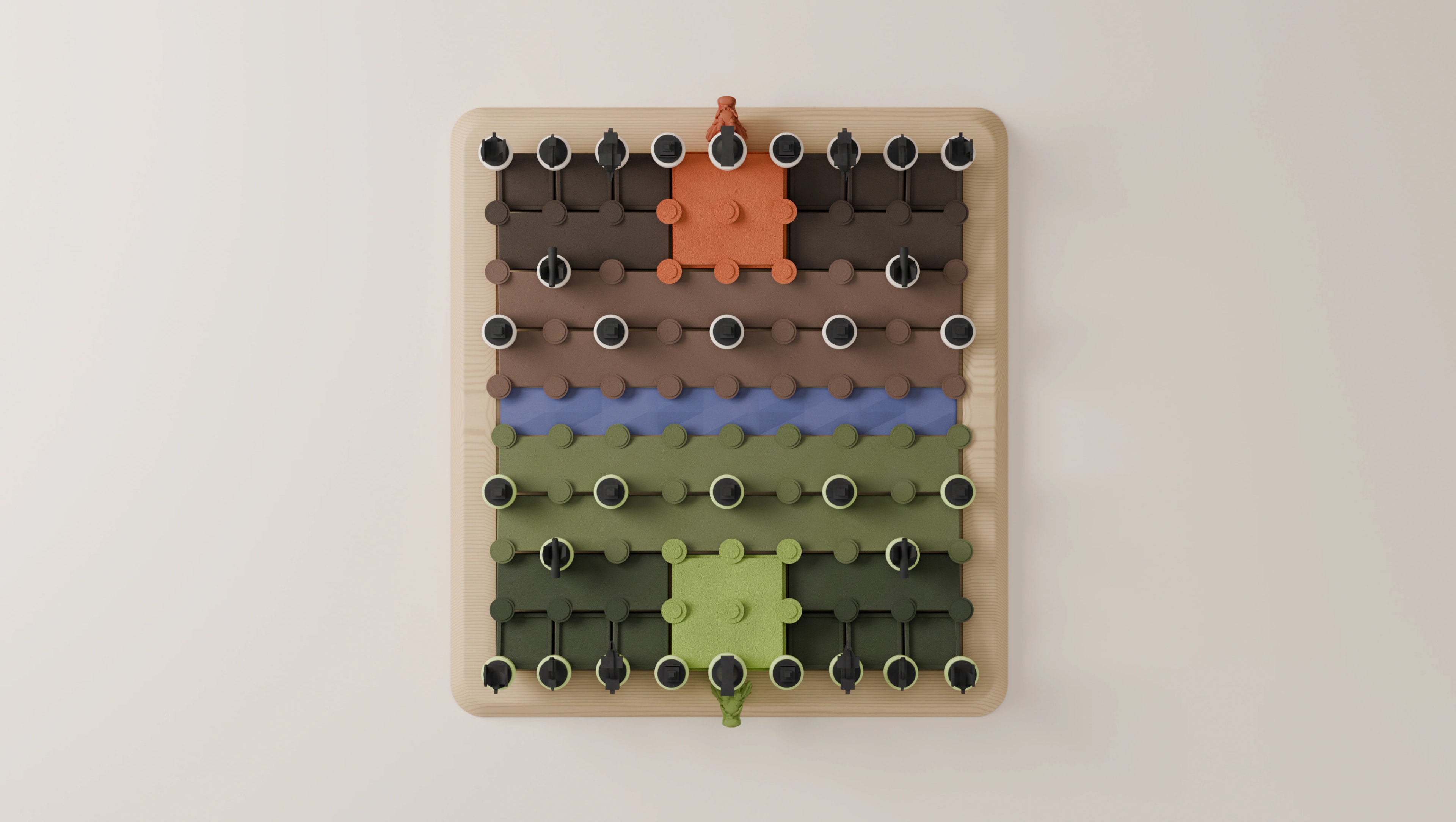
The board starts from a familiar rectangular footprint. Inside it, the surface breaks into long bands, steps and larger palace volumes, and a low, rounded frame gives the expressive interior a calm boundary.
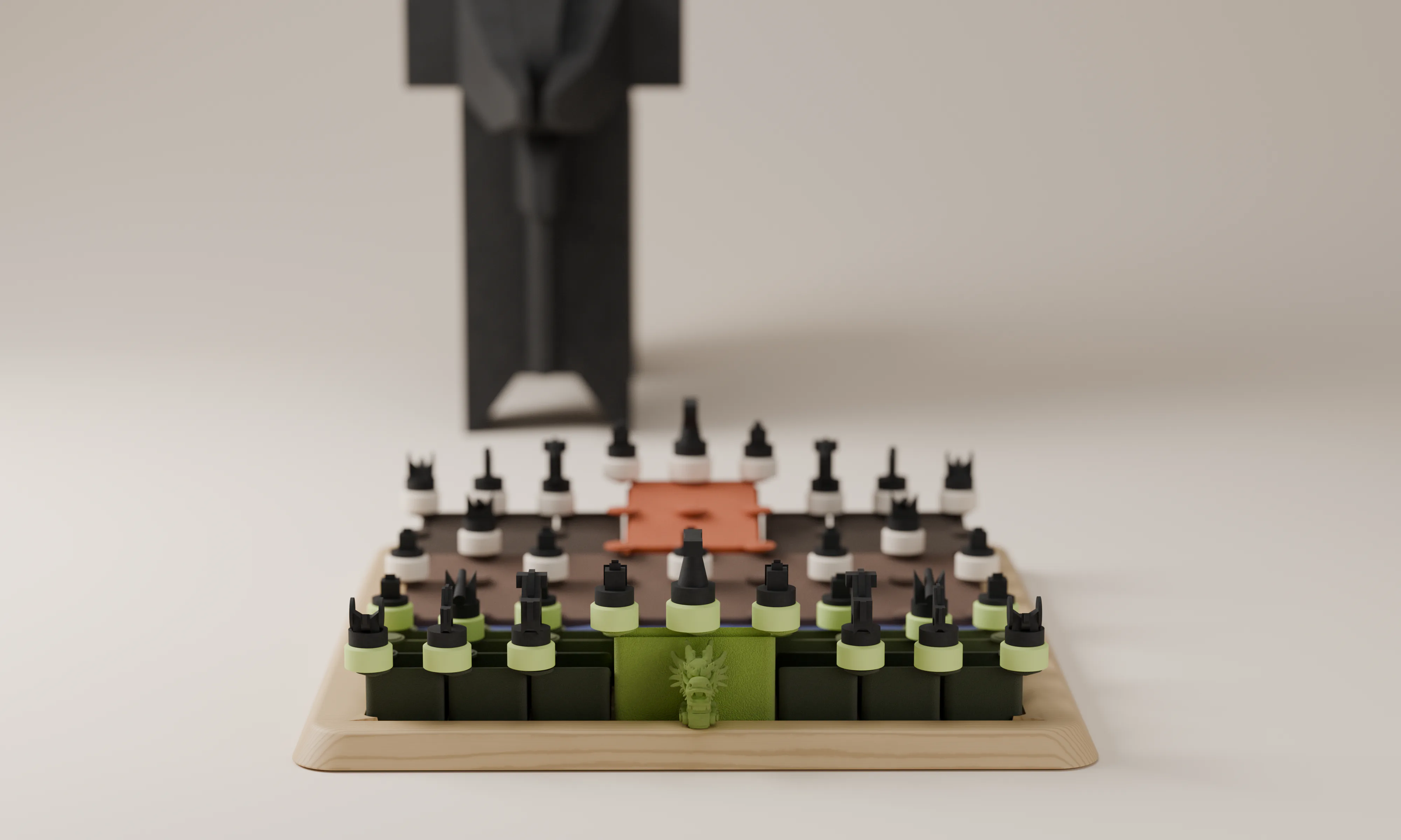
The blue river is the clearest visual pause. It separates the sides, and gives the eye a place to reset within the dense field of circular positions. Small sculptural motifs near the palaces add character - but they stay secondary, never standing in for pieces or covering the grid.
Two palettes, instead of one red-versus-black split
One side
- Dark olive
- Light green
- Light-green palace
The other side
- Warm brown
- Charcoal
- Terracotta palace
Between them
- Recessed blue river
Design decision
Let the board's silhouette carry the concept; let the repeated positions carry the game.
04The river
A rule boundary becomes a visual boundary
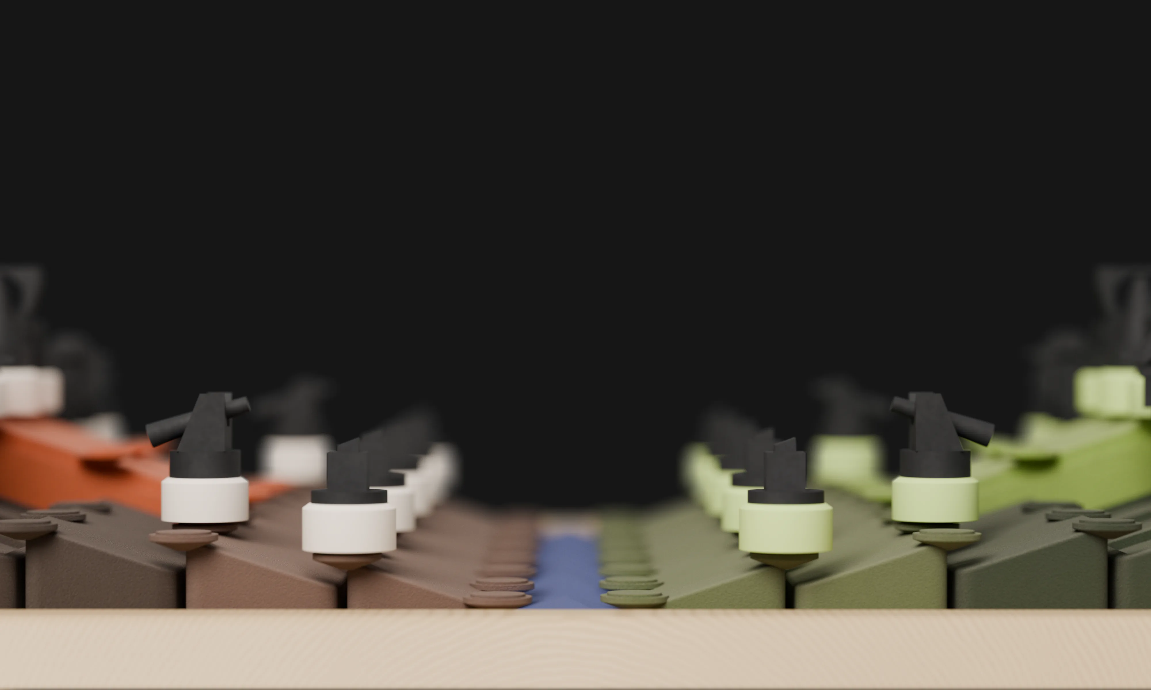
The river isn't filler between two halves. It's one of Xiangqi's defining features, so it gets a material and colour language distinct from the territories around it.
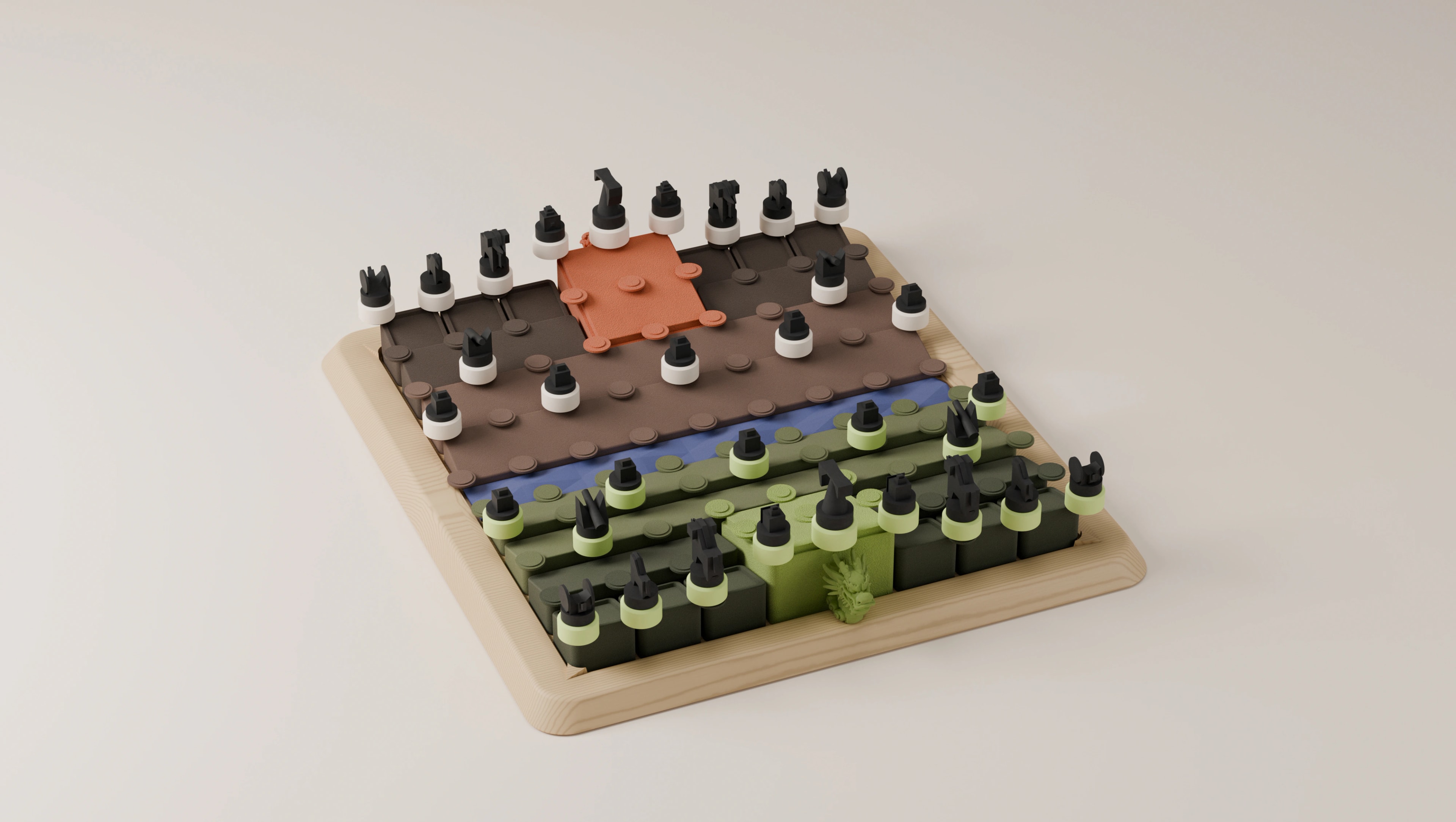
From a distance, the recess is the first thing that tells a viewer this is a divided field. From a player's seat, it helps orient the two sides at a glance. The open question is whether that strength stays useful in play: the banks still have to make the playable intersections and the files running across the river easy to read.
Design principle
A strong metaphor earns its place when it also improves orientation.
05Palaces & sides
Identity for each territory, without losing symmetry
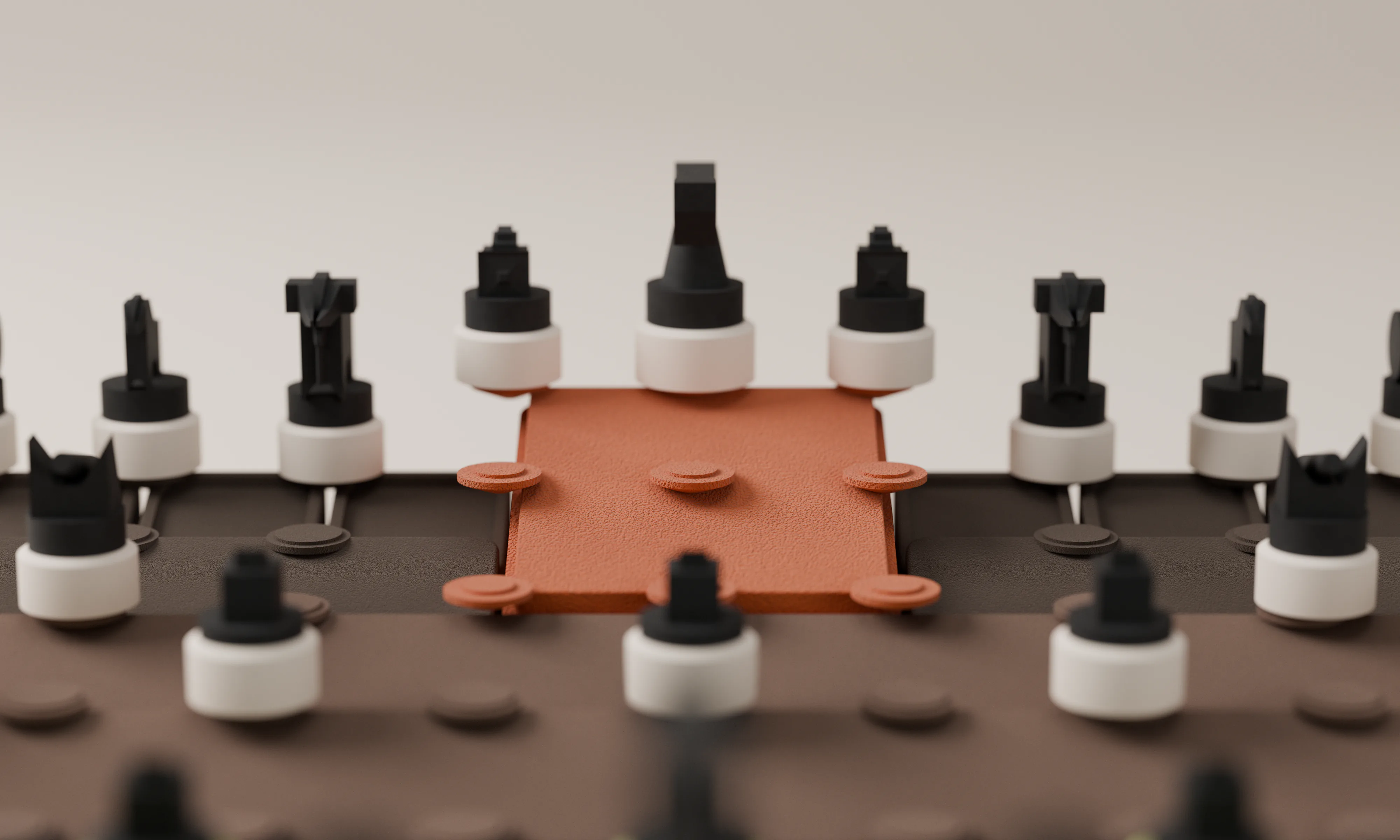
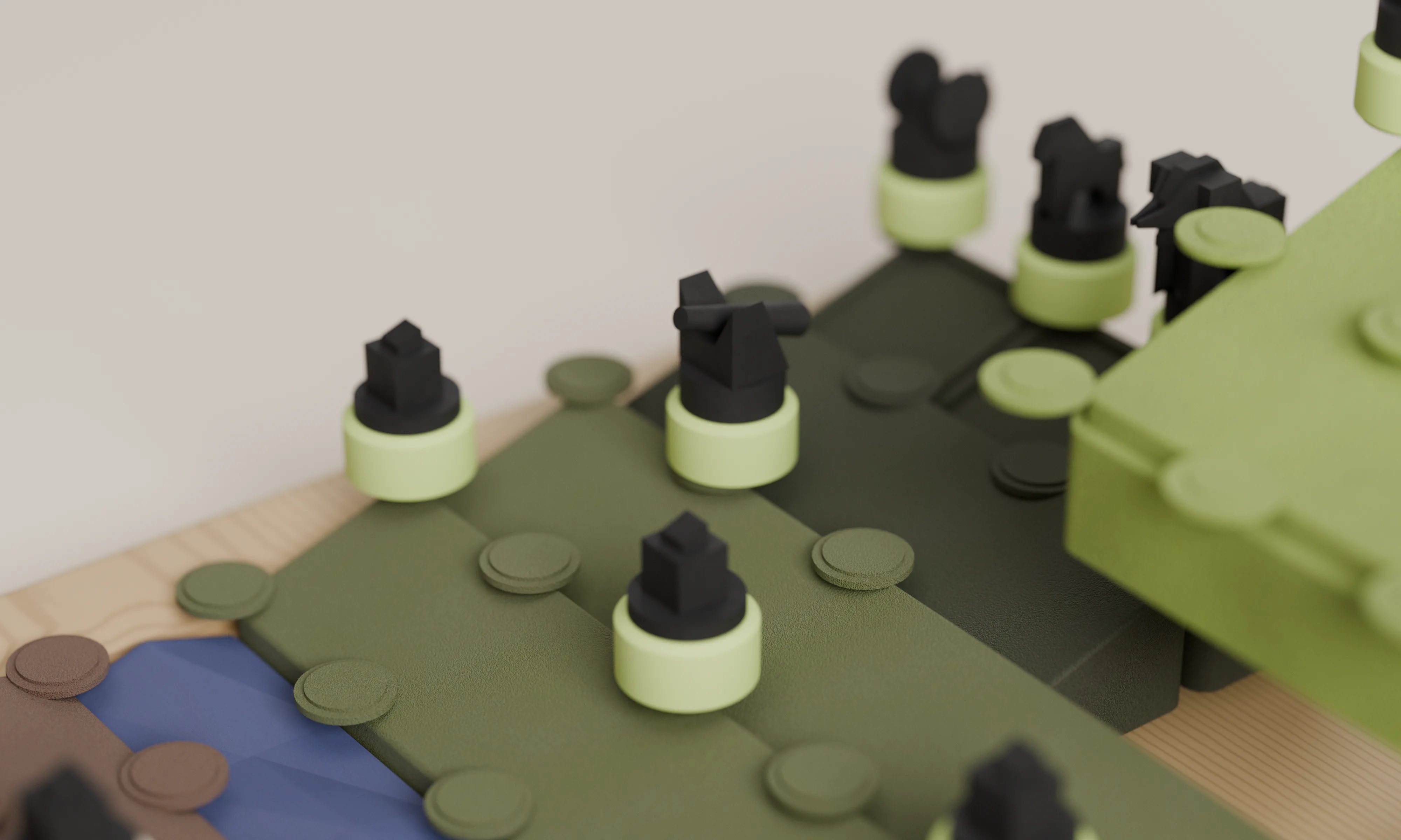
The two sides differ on purpose, in colour and elevation. The terracotta and light-green palaces become focal points in their territories, which is what makes the set feel like a designed object rather than a neutral board with graphics applied.
But a game board also needs fairness of perception. Both players should find their own palace, read the same grid and reach the same kinds of positions as comfortably. A taller or more detailed zone can't make one side harder to play - so the next iteration has to be checked from both seats, not only from the three-quarter hero angle.
Design principle
Asymmetry can shape the object; playability must remain equivalent.
06Legibility
Sculpture can't replace the basic interaction
The concept's biggest risk is also its main attraction: elevation. Raised blocks create depth, but they can interrupt the reading of a straight line or hide a piece sitting lower down.
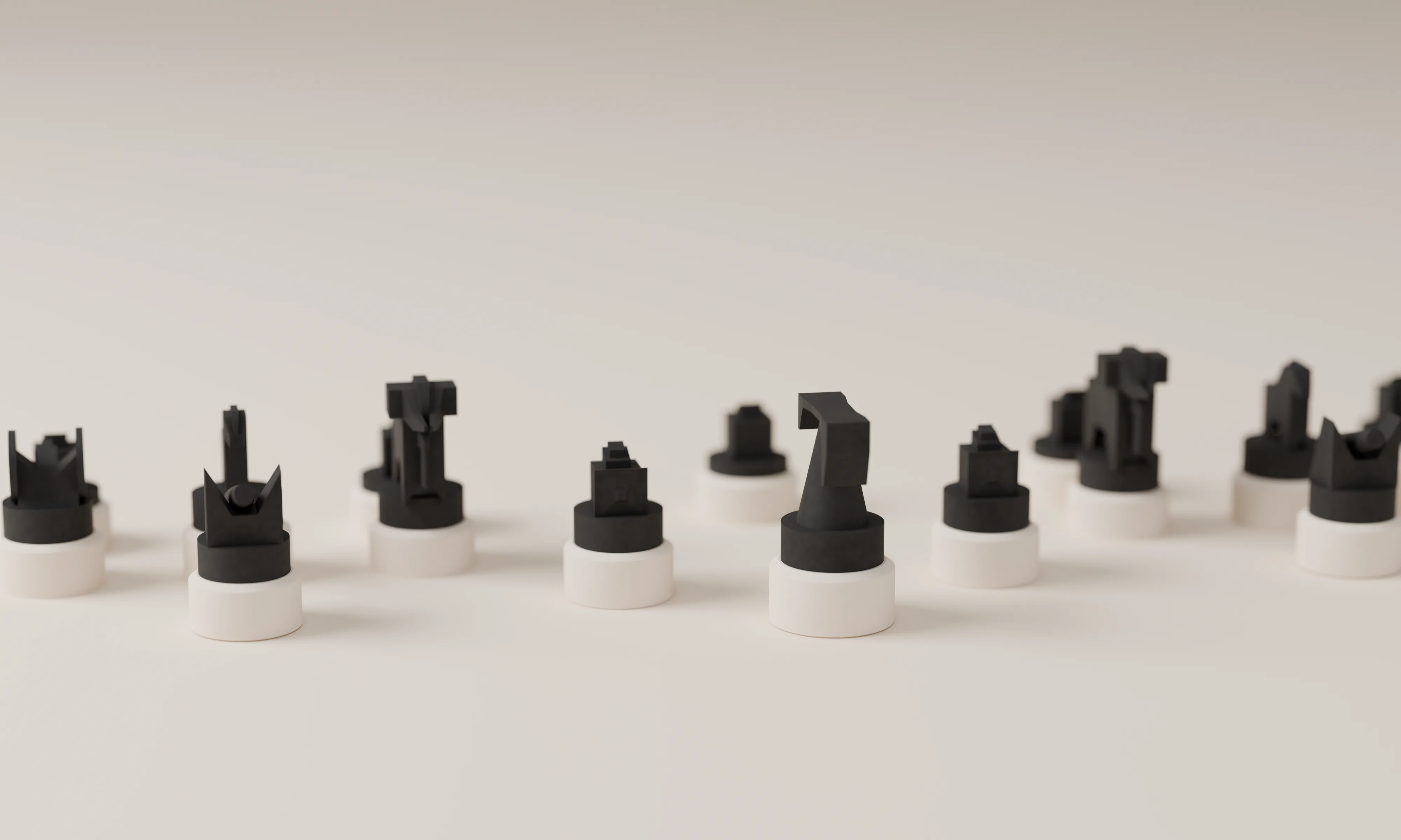
Xiangqi pieces occupy intersections, not squares, so the circular markers have to work as an unambiguous map of the playable nodes - with clear connections between them across changes in height and at the river edge. The render doesn't yet prove that, or settle final piece markings. A physical board would be tested against four questions:
- 01
Every node reads
An experienced player can read all 90 intersections from either seat.
- 02
The anatomy reads
Palaces, river and piece positions are clear without the hero render's camera angle.
- 03
Height doesn't get in the way
Raised sections don't block sightlines or make moving and capturing awkward.
- 04
Not colour alone
The two sides and every piece type can be told apart without relying on colour.
Design principle
Novelty belongs in the physical expression - not in the rules a player must relearn.
07CMF
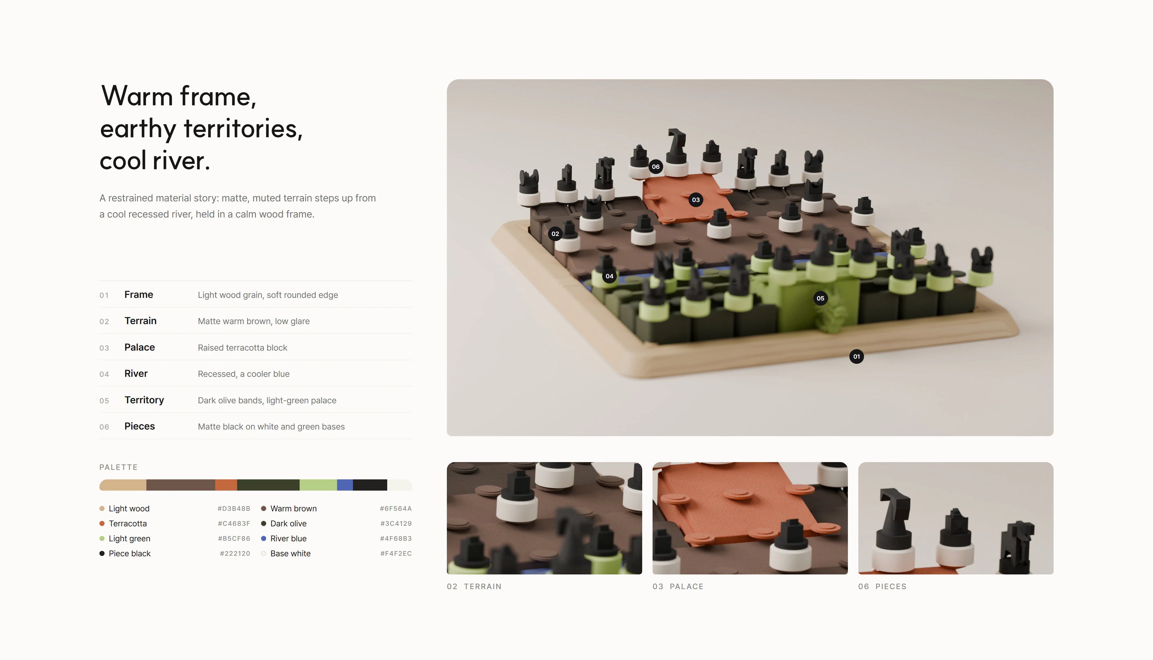
Warm frame, earthy territories, cool river
The render proposes a restrained material story. The position markers matter most: they're the interface between the expressive terrain and the precise grid, so their tactile and visual consistency carries the whole board.
Outer frame
- Light wood grain
- Rounded edges that hold the composition
Playing terrain
- Matte, muted earth colours
- Less glare across raised surfaces
River
- Cooler blue surface
- Contrast, but never the only cue
Position markers
- Small repeated circular forms
- Consistent to touch and to see
These are rendered intentions, not confirmed production materials. A prototype would show whether wood, moulded parts, coated surfaces or a combination can deliver the same look with enough durability and tolerance.
08From render to product
The next design problem is construction
A physical product needs more than a compelling top view. The stepped surface suggests several parts or layers seated in one frame, which opens the practical questions for the next phase.
- How are raised sections located and secured so the grid never drifts?
- How much height variation can players tolerate before moves become awkward?
- Where do captured pieces - and the full set - go between games?
Playable digital prototype
Built - the rendered model with the full rules, played from both seats
Full-scale interaction prototype
A complete grid and temporary labelled pieces - reach, visibility, stability and rule legibility
Refine joinery and construction
Once the geometry is proven
CMF samples
Finishes on the proven form
Design principle
Prove the playing surface before polishing the collectible object.
Two players · one screen · loads ~2 MB
09Outcome
Familiar elements, turned into architecture
The concept makes Xiangqi's own elements the visual structure of a tabletop product. It's a design direction, not a claim of validated ergonomics or manufacturing readiness - the full-scale prototype is the next decision gate.
The river becomes a physical divide
It anchors the composition and helps orient the two territories.
The palaces become focal volumes
They give the board a recognisable hierarchy and sculptural character.
The frame gives the terrain a home
Its warm, simple outline lets the interior be expressive without feeling uncontrolled.
The positions remain the interface
Their final spacing, connections and markings decide whether the concept succeeds as a game.
10Reflection
A game object has to be judged while it's being used
The interesting part wasn't making Xiangqi look more dramatic. It was letting the board's cultural and spatial logic generate a form that still serves play. The render shows the visual opportunity - and exposes what has to be resolved next: grid continuity, reach, piece identity, construction and storage.
That tension is the work. If the raised landscape makes the game less clear, it gets reduced. If it helps players understand the field and makes the set worth keeping in view, it has earned its form.
A strong physical concept should be memorable at rest and reliable in use.
Takeaway
Territories become form. The river becomes space. The palaces become focal points. The intersections remain the interface.