Project 05Branding
← All workLambda Biologics
A brand identity for an organoid biotech, grown from one continuous movement and published as the online guideline its teams build from.
Lambda Biologics grows patient-derived organoids for drug discovery. The identity is built from one idea: the lambda waveform, a single continuous movement from one state to another, drawn as a symbol and repeated into every pattern, grid and detail the brand uses.
The guidelines are where it lives day to day, so they are presented here as they were designed - an online guideline with a page for each foundation. Use the sidebar to move through it.
- Client
- Lambda Biologics
- Scope
- Brand identity & visual system
- Format
- Online guidelines, nine pages
- Year
- 2026
- Agency
- FusionCell
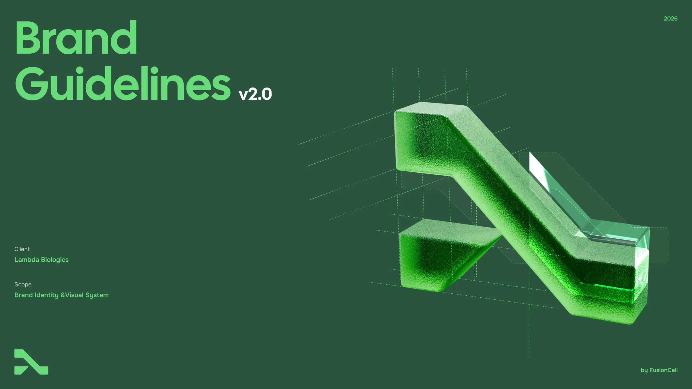
Brand Guidelines
v2.0 · 2026
Foundations
This is the foundational DNA of Lambda Biologics: the standards, visual elements and guidance for how they come together, whichever team you are on and whatever you are making — a protocol, a poster or a product page.
You’ll find our logo system, color values, typography, graphic language, imagery and the voice we write in.
Questions? Reach the brand team at brand@lambdabiologics.com.