Project 05Branding
← All workLambda Biologics
A brand identity for an organoid biotech, grown from one continuous movement and published as the online guideline its teams build from.
Lambda Biologics grows patient-derived organoids for drug discovery. The identity is built from one idea: the lambda waveform, a single continuous movement from one state to another, drawn as a symbol and repeated into every pattern, grid and detail the brand uses.
The guidelines are where it lives day to day, so they are presented here as they were designed - an online guideline with a page for each foundation. Use the sidebar to move through it.
- Client
- Lambda Biologics
- Scope
- Brand identity & visual system
- Format
- Online guidelines, nine pages
- Year
- 2026
- Agency
- FusionCell
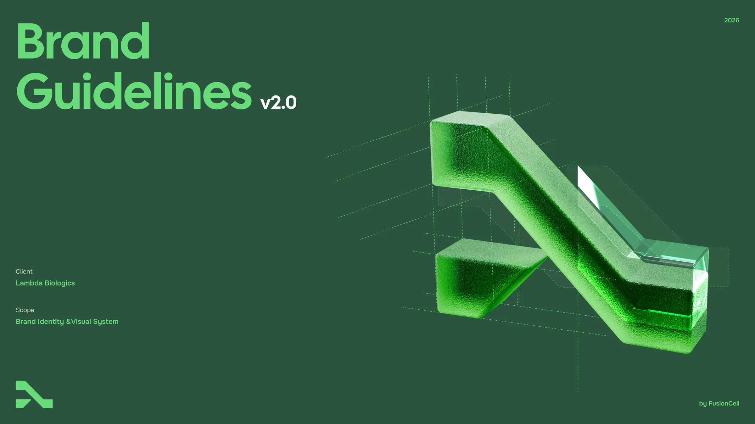
Brand Guidelines
v2.0 · 2026
Graphics
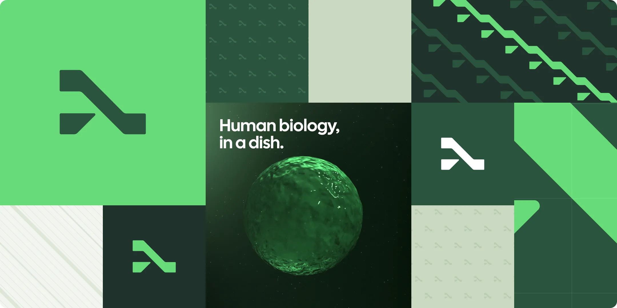
Our graphic language grows from one source: the symbol. Linked, it becomes a continuous path; repeated small, a texture; reduced to its diagonal, a line field; enlarged, a supergraphic. Patterns stay tone-on-tone — the content is always the hero.
Pattern system
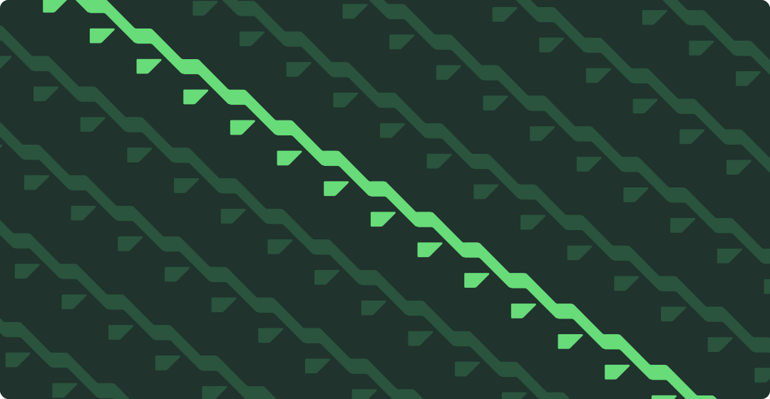
Four patterns, all built from the symbol and its 4 × 3 module grid. Each comes in a dark and a light tone and is designed to sit behind content: low contrast, generous spacing and at most one accent.
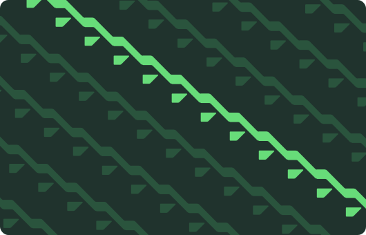
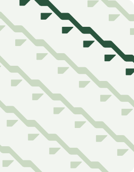
Flow
Chained symbols — each foot becomes the next head, forming one continuous path. One accent lane, never more.
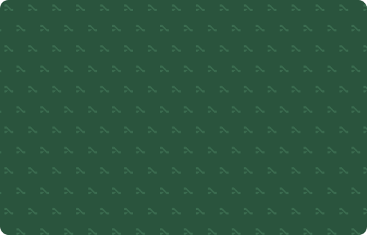

Micro
Small symbols on a half-drop grid, tone-on-tone. A quiet texture for large surfaces and packaging.
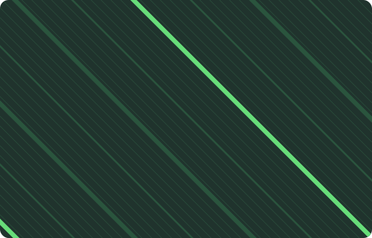

Lines
A 45° field taken from the diagonal band, with a thin–bold rhythm. Technical and calm.

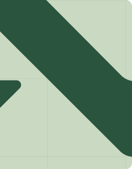
Supergraphic
The symbol enlarged on its module grid and cropped decisively. For covers, banners and environments.
Composition
Patterns, solid color, the symbol and imagery combine on a modular tile grid. Mix tone and texture so neighbouring tiles always contrast, and keep one hero tile per composition.
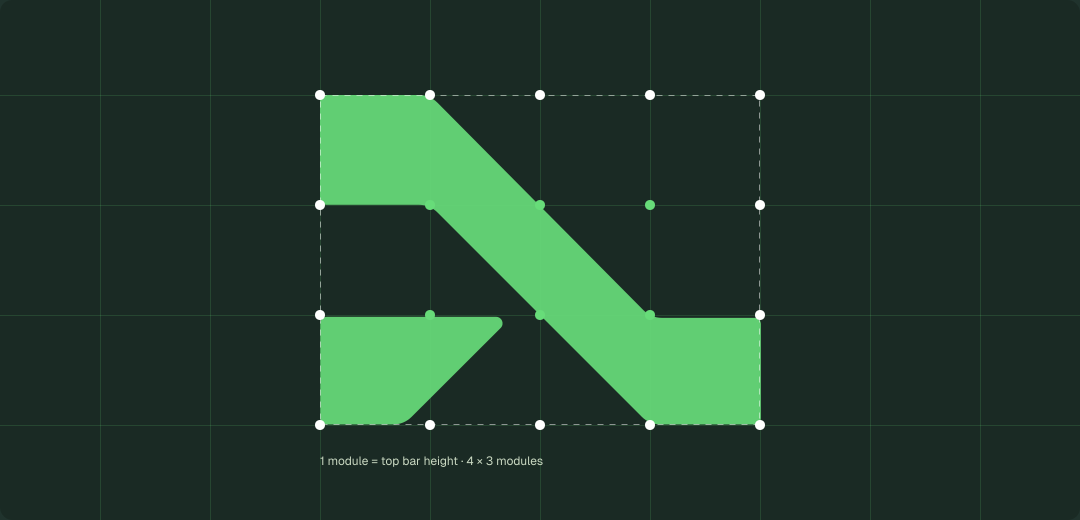
Grid system
The symbol sits on a 4 × 3 grid of square modules, where one module equals the height of its top bar. Enlarged or cropped, this construction becomes a quiet, technical framework for presentations and covers.
Close-up detail
Details cropped from the symbol — the corner, the diagonal band, the foot — become decal-like accents for stationery, packaging and labels. Crop decisively so at least one recognisable edge remains.

Top corner

Diagonal band

Foot
Digital components
Buttons, tags and links share one logic: highlighted brand color and an arrow for action, soft neutrals for information, and the close-up detail for navigation. One primary button per view.
- Organoids
- Drug discovery
- Oncology
- Breakthrough in modeling
- ODISEI
CTA buttons
Vital Green primary, Lambda Green secondary, outline for low emphasis.
Social tags
Neutral and never clickable-looking.
Link button
Underlined text led by a close-up detail.
Incorrect usage
Keep the graphic system calm and recognisable.
Organoids replicate key features of human tissue for predictive studies.
Don’t put patterns behind text
Patterns sit behind content blocks, not body copy.
Don’t break the chain
Keep symbols linked foot-to-head at one angle; never mirror or scatter them.
Don’t recolor the pattern
Use the Dark or Light tones only; one Vital Green accent at most.
Resources
Graphic assets and UI components.
Downloads
- Pattern tiles (SVG, PNG)
- Grid & close-up detail kit
- Figma UI components — buttons, tags, links