Project 05Branding
← All workLambda Biologics
A brand identity for an organoid biotech, grown from one continuous movement and published as the online guideline its teams build from.
Lambda Biologics grows patient-derived organoids for drug discovery. The identity is built from one idea: the lambda waveform, a single continuous movement from one state to another, drawn as a symbol and repeated into every pattern, grid and detail the brand uses.
The guidelines are where it lives day to day, so they are presented here as they were designed - an online guideline with a page for each foundation. Use the sidebar to move through it.
- Client
- Lambda Biologics
- Scope
- Brand identity & visual system
- Format
- Online guidelines, nine pages
- Year
- 2026
- Agency
- FusionCell
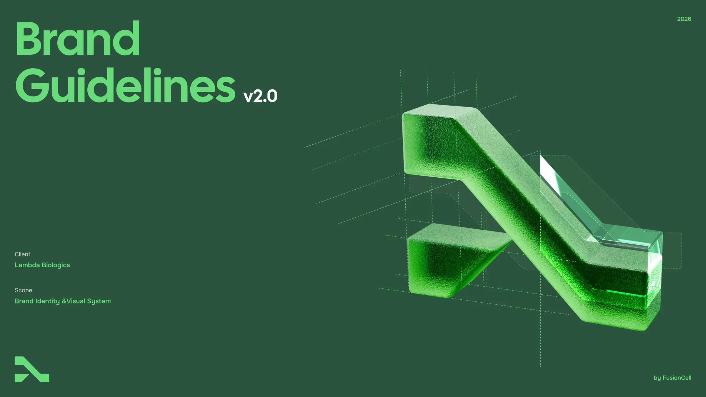
Brand Guidelines
v2.0 · 2026
Logo
The Lambda Biologics logo is precise, structural and instantly recognisable. Its symbol draws on the lambda waveform: a single continuous movement from one state to another — the path from biology to insight.
- Name:
- Primary logo
- Format:
- SVG · PDF · PNG
- Lockup:
- Symbol + logotype
- Version:
- 2026
Primary logo
Our primary logo pairs the symbol with the logotype in a fixed horizontal lockup. It is the default for all communications whenever space allows. Four color variants cover every background:
- Lambda Green on light
- White on dark
- Black monochrome
- White monochrome
Lambda Green on light
White on dark
Black monochrome
White monochrome
Symbol & vertical
The symbol is the most minimal expression of Lambda Biologics. Use it where the name is already present or not needed: app icons, favicons, avatars and small spaces.
The vertical logo is used sparingly — for narrow formats where the primary logo does not fit and the symbol alone lacks context.
Symbol
Icons, favicons, avatars, merchandise.
Vertical logo
Narrow and small-format print (A6–A7).
Variant selector
Background color decides which logo variant to use. Always pick the variant with the strongest contrast. When in doubt, use this chart.
White → Lambda Green logo
Cell Mist → Lambda Green logo
Vital Green → Black logo
Lambda Green → White logo
Deep Bio Green → White logo
Black → White logo
Rule of thumb: Lambda Green or Black on light and Vital Green backgrounds; White on Lambda Green, Deep Bio Green and Black. Never white on Vital Green.
Clear space
Clear space keeps the logo distinguishable from everything around it. The unit x equals the space between “Lambda” and “Biologics”. Keep at least 1x free on every side.
Minimum size
Below the minimum size the logotype loses legibility. Switch to the symbol instead.
- Logo:
- Primary logo
- Digital:
- 35 px
- Print:
- 12 mm
- Logo:
- Vertical logo
- Digital:
- 60 px
- Print:
- 20 mm
- Logo:
- Symbol
- Digital:
- 16 px
- Print:
- 5 mm
Hierarchy & lockups
Products carry the master brand. We “claim” a product by placing Lambda Biologics in front of its name, and lock product names up with the logo using a divider and fixed spacing.
Claiming: Lambda Biologics OrganoEZ™ OncoPlex Colon
Lockup: logo | product name, set in Cal Sans at the logotype’s cap height.
- Divider:
- 2 px, Lambda Green, 1.5x height
- Spacing:
- 2x either side of the divider
- Name:
- Cal Sans, optical cap height of logotype
Product name shown is typeset as a placeholder — replace with the final OrganoEZ wordmark when available.
Incorrect usage
The logo is a fixed asset. Never redraw, recolor or modify it.

Don’t stretch or distort
Always scale proportionally.

Don’t rotate
Keep the logo horizontal and upright.
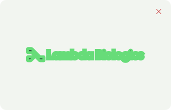
Don’t add outlines
No strokes, keylines or containers that alter the mark.

Don’t recolor
Use only the approved variants.

Don’t add effects
No shadows, glows or blurs.
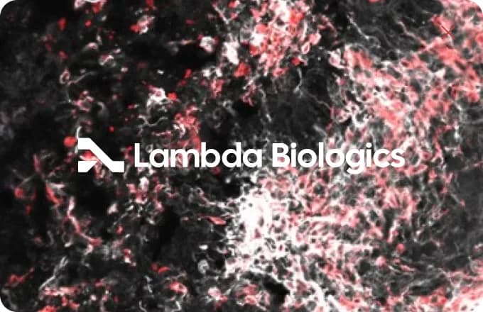
Don’t place on busy images
Use a solid container block on photography.
Resources
Everything you need to use the logo correctly, in every format.
Downloads
- Logo pack — all variants (SVG, PDF, PNG)
- Symbol & app icon set
- Product lockup templates
- Logo usage one-pager (PDF)