Project 05Branding
← All workLambda Biologics
A brand identity for an organoid biotech, grown from one continuous movement and published as the online guideline its teams build from.
Lambda Biologics grows patient-derived organoids for drug discovery. The identity is built from one idea: the lambda waveform, a single continuous movement from one state to another, drawn as a symbol and repeated into every pattern, grid and detail the brand uses.
The guidelines are where it lives day to day, so they are presented here as they were designed - an online guideline with a page for each foundation. Use the sidebar to move through it.
- Client
- Lambda Biologics
- Scope
- Brand identity & visual system
- Format
- Online guidelines, nine pages
- Year
- 2026
- Agency
- FusionCell
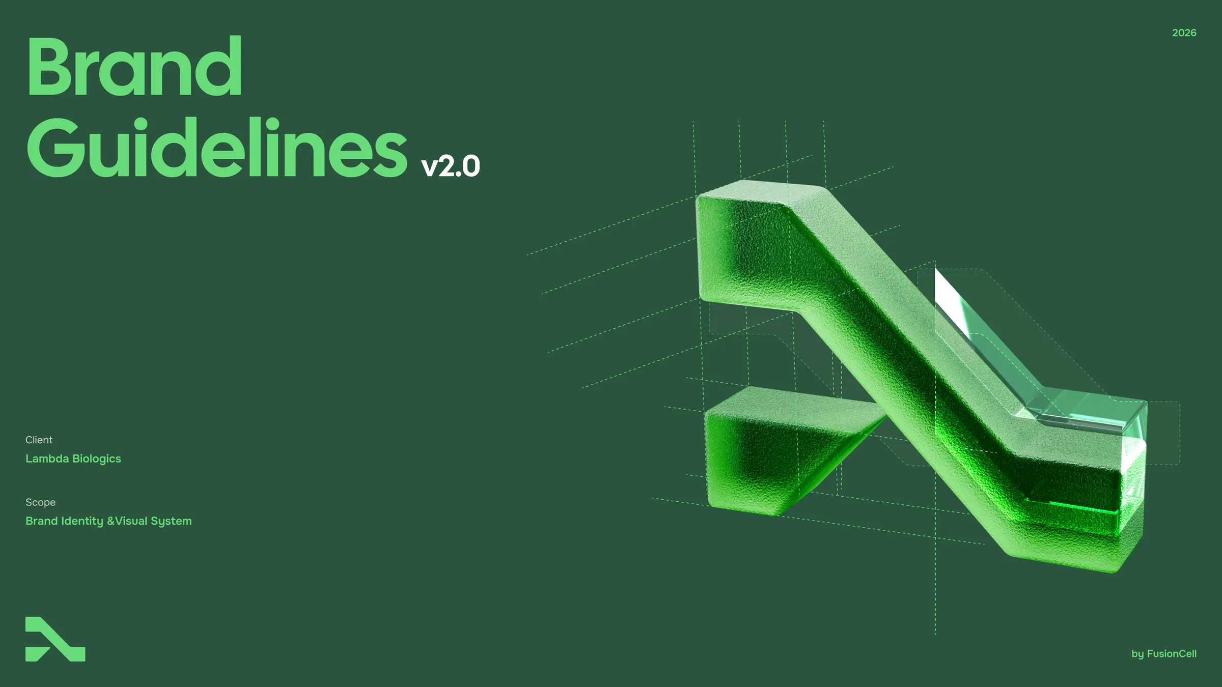
Brand Guidelines
v2.0 · 2026
Applications
Applications bring the system together. Stationery, decks and packaging are built from the same logo, colour, pattern and type rules — and every piece on this page is a live, editable component.
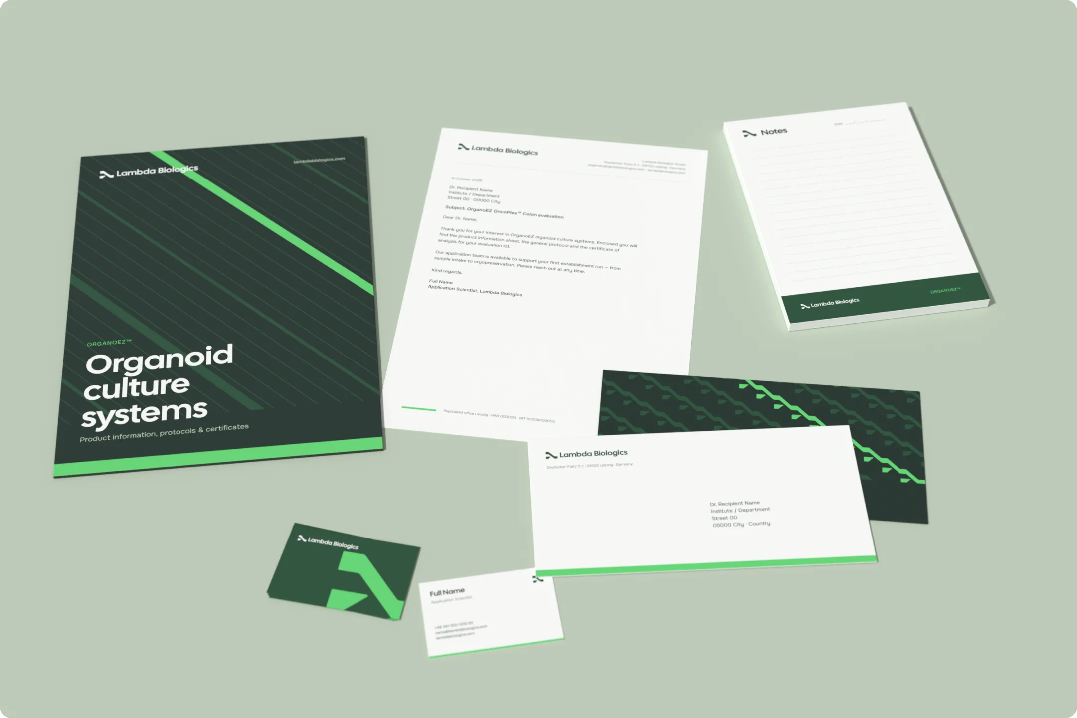
Corporate stationery
Print stays calm: white or Deep Bio Green grounds, one Vital Green accent strip and the logo top-left. Patterns belong on covers and backs, never behind body copy. Every piece is built at true size (4 px = 1 mm).
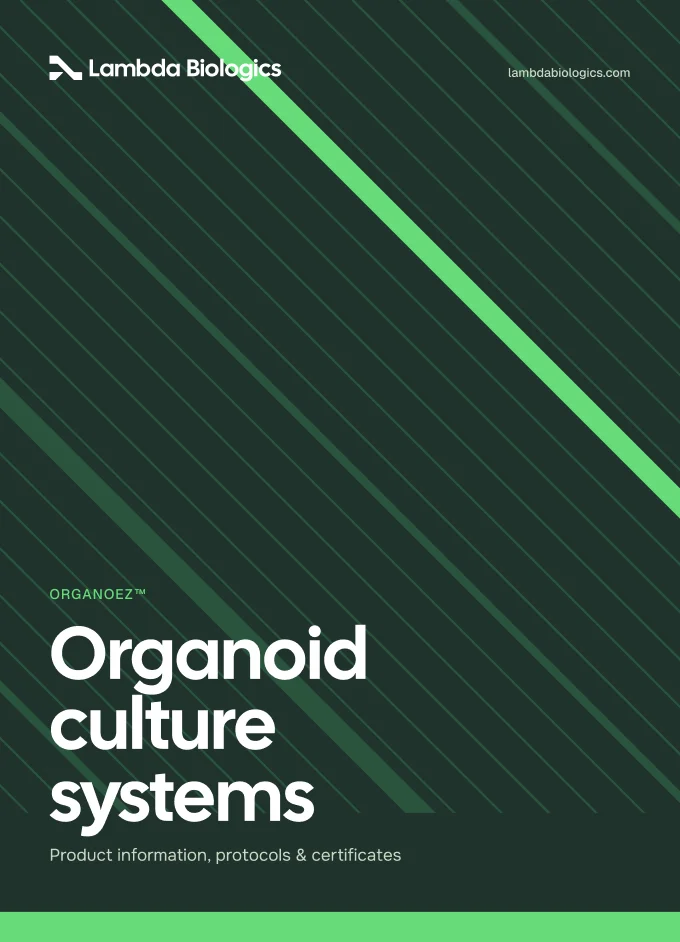
Folder — front cover
220 × 305 mm · Lines pattern, Dark
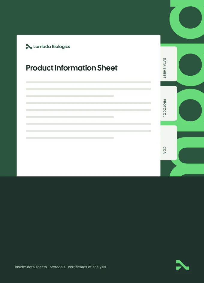
Folder — inside pocket
Tabbed inserts for data sheet, protocol, CoA
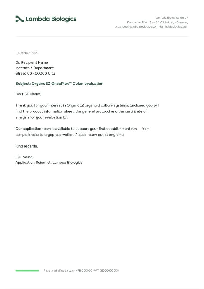
Letterhead
A4 · 210 × 297 mm
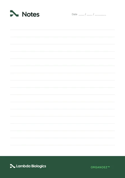
Notepad
A5 · 148 × 210 mm
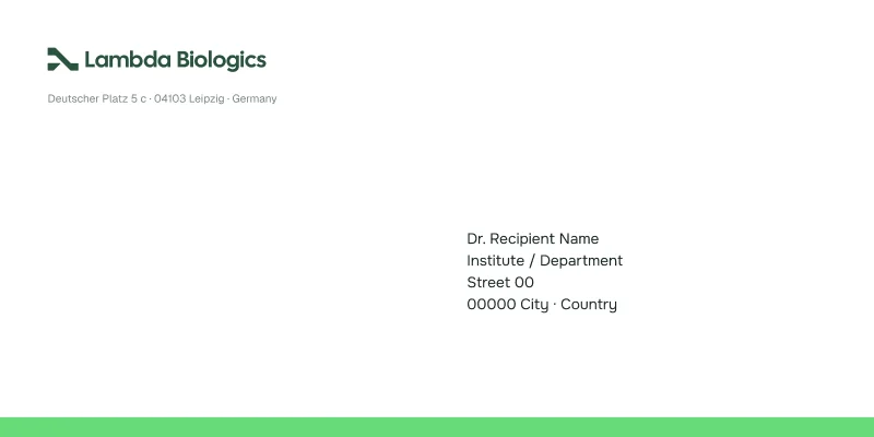
Envelope — front
DL · 220 × 110 mm

Envelope — back
Flow pattern, Dark

Business card — front
85 × 55 mm
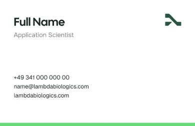
Business card — back
Name · role · contact
Presentation
Decks run on Deep Bio Green with paper-coloured content cards. One idea per slide, titles in Cal Sans, imagery graded to Lambda Green. Dividers go full-bleed with a single line of type.
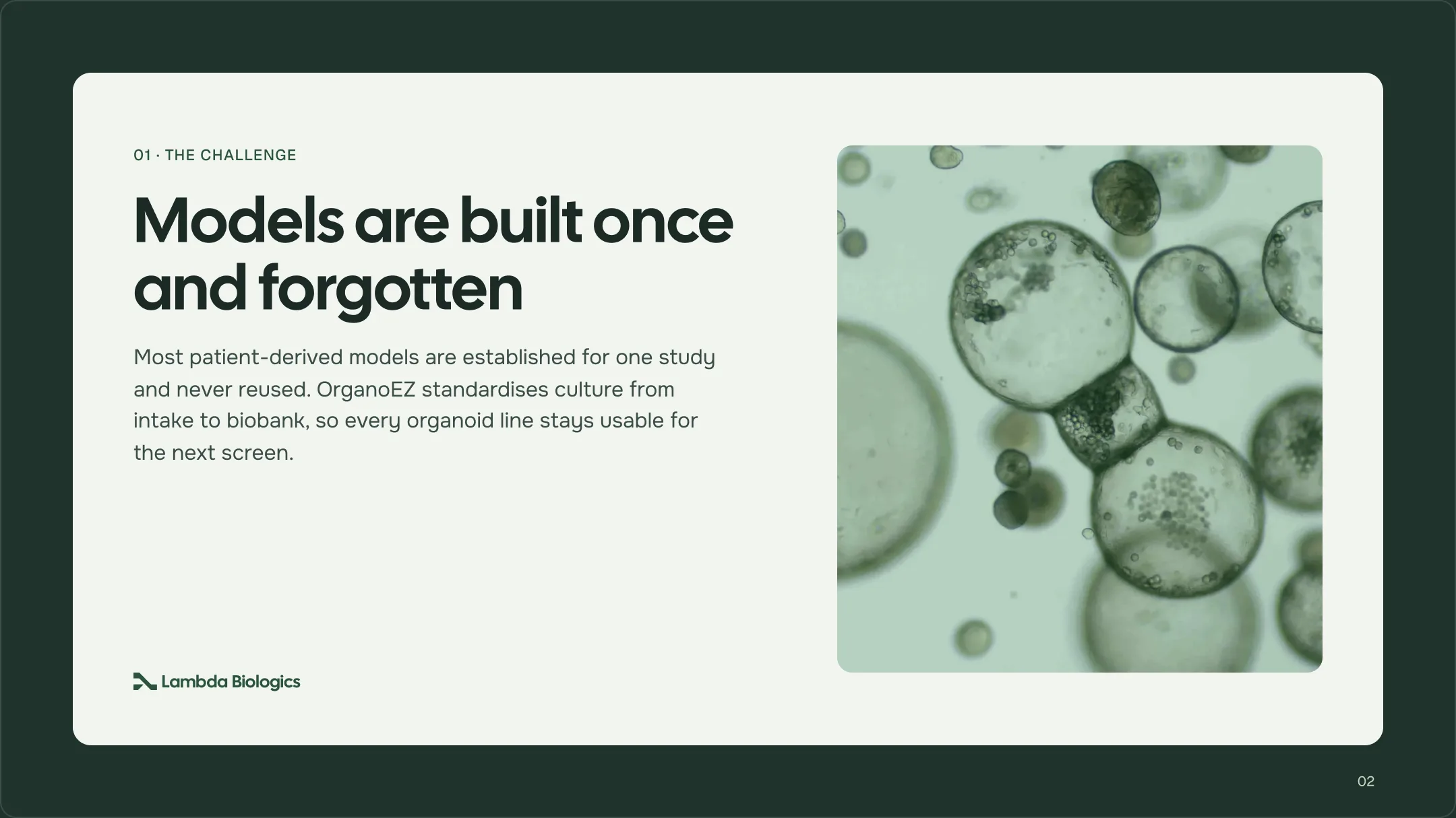
Content slide
1920 × 1080 · card on Deep Bio Green
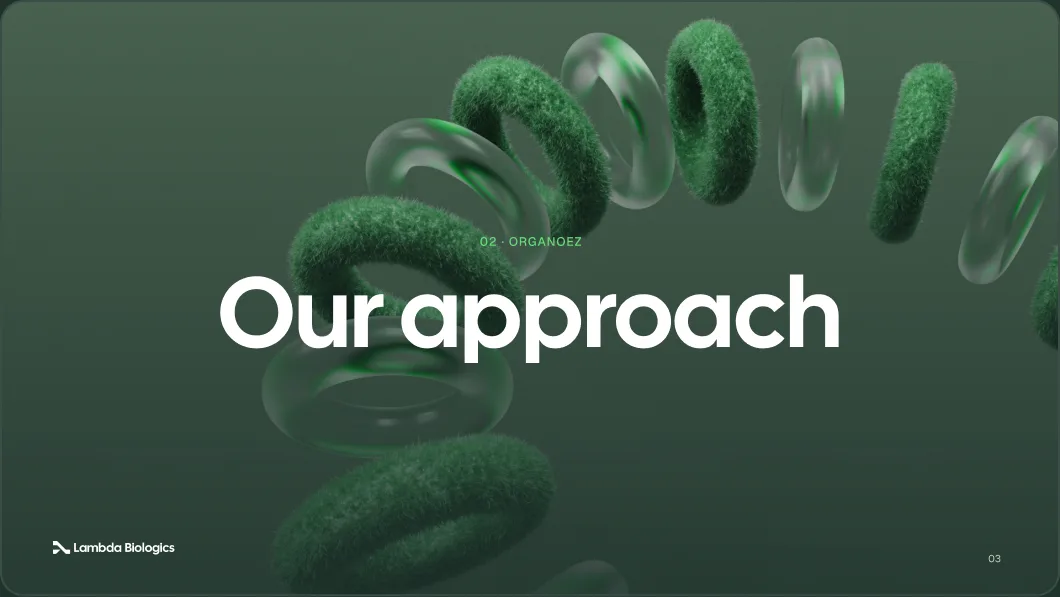
Divider slide
Full-bleed graded image + one line
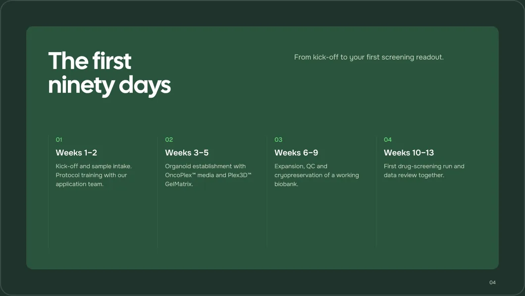
Timeline slide
Lambda Green card, Vital Green numerals
Kit & packaging
Packaging is where Vital Green leads. The supergraphic wraps the lid, the OrganoEZ wordmark sits large, and every label repeats one hierarchy: sub-brand eyebrow, product name, then specs.
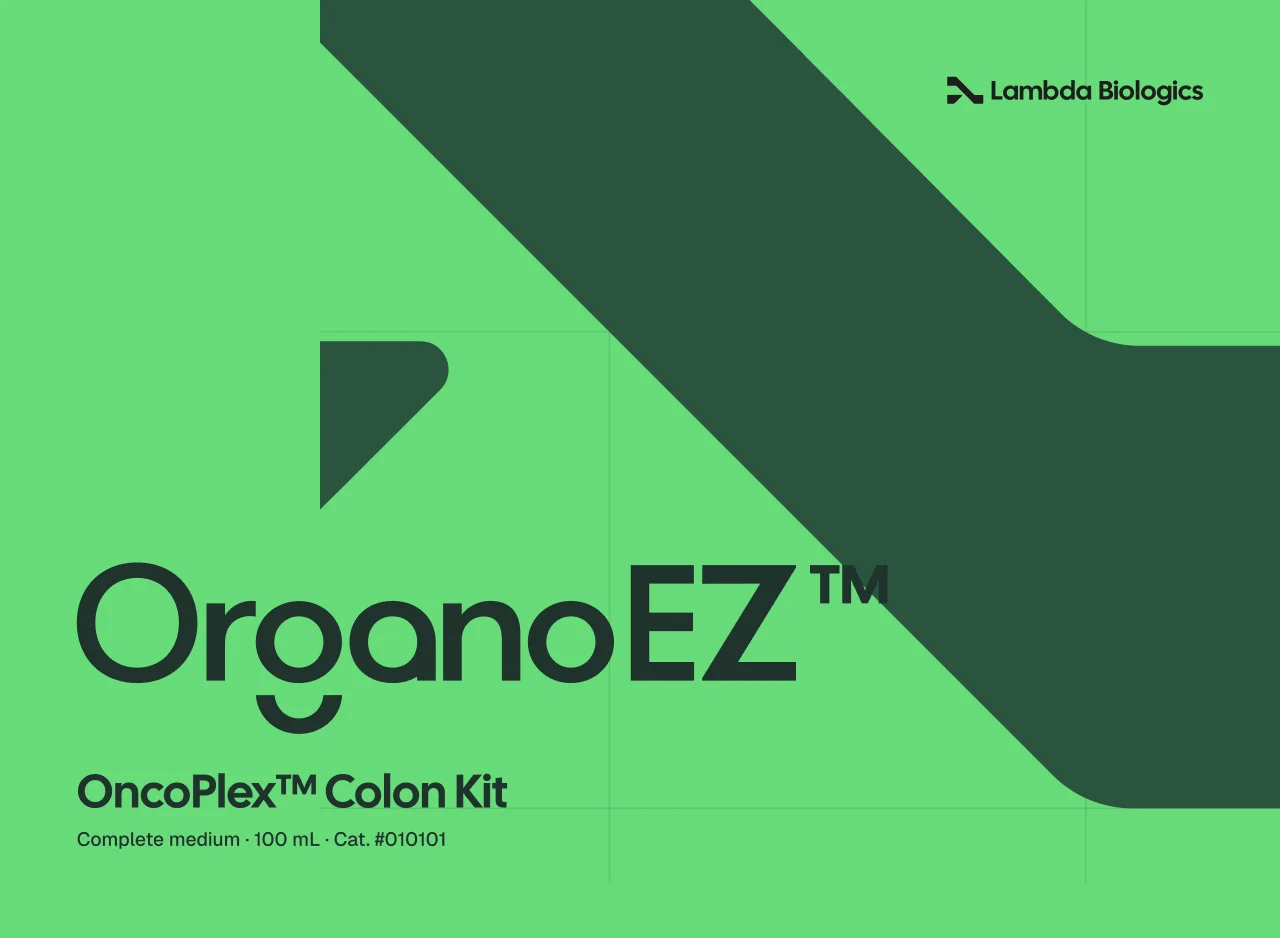
Kit box — lid
300 × 220 mm · Supergraphic on Vital Green

Kit box — side
40 mm depth · storage line
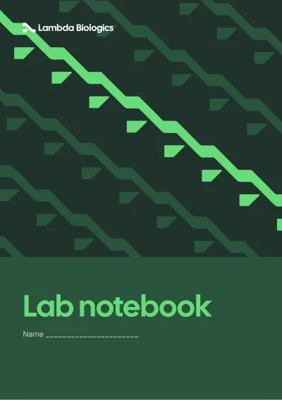
Lab notebook
A5 cover · Flow pattern

Seal sticker
Ø 40 mm
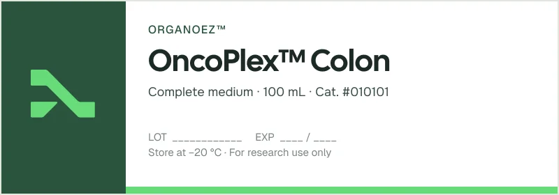
Vial label
100 × 35 mm · wraps 100 mL bottle
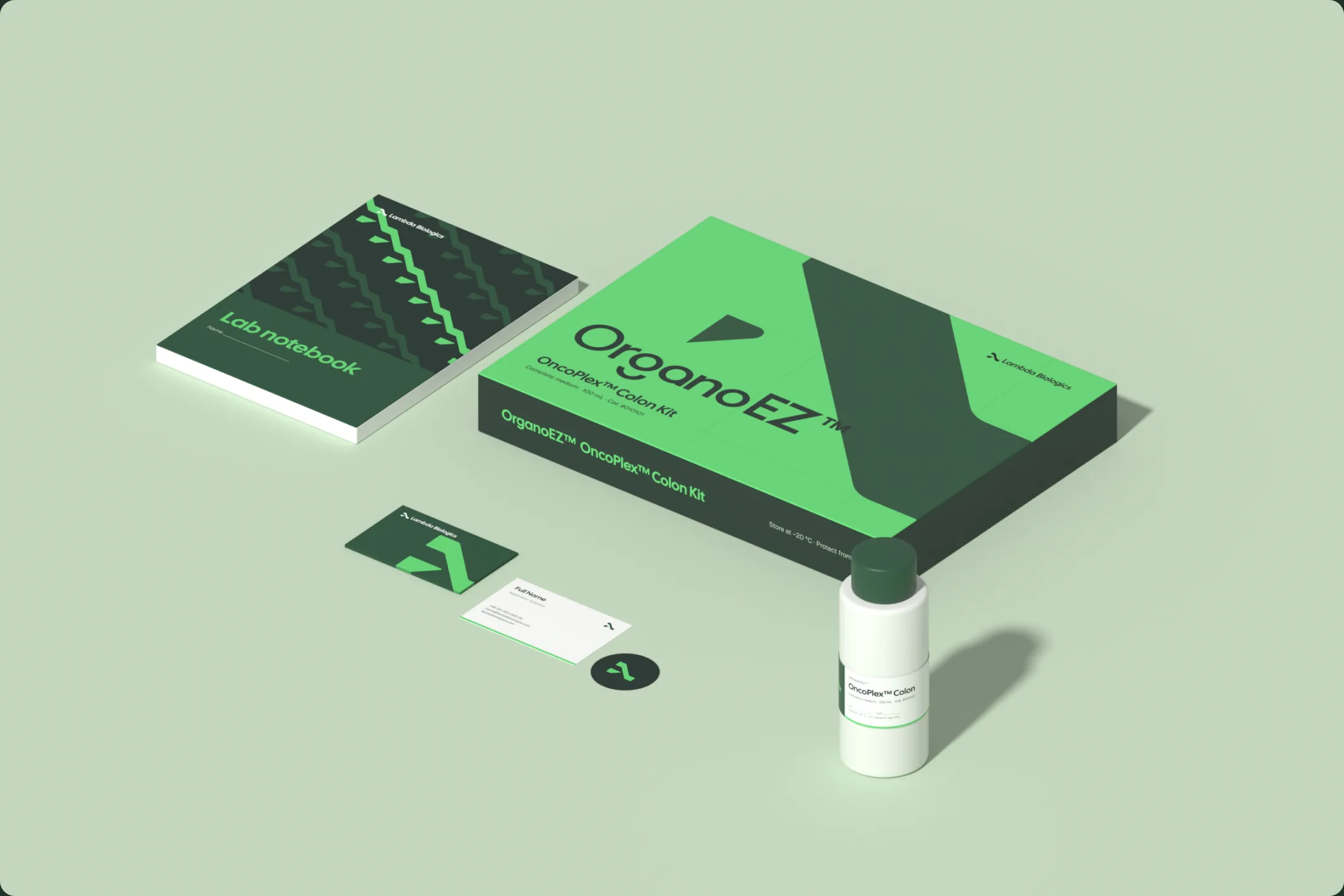
In context
Rendered mockups of the pieces above, for decks, social and case studies. After a design change, re-export the textures and re-render from lb_mockups.blend.
Application rules
Four rules keep every new piece recognisably Lambda.
- 01
One accent
Lead with a single Vital Green moment per surface — a strip, a badge or the wordmark. Never set body text in it.
- 02
Logo placement
Top-left on stationery and covers, bottom-left on slides. Keep clear space of one symbol height.
- 03
Patterns frame, never fill
Flow, Lines and Supergraphic go on covers, backs and lids — kept clear of text areas.
- 04
True to size
Build print at 4 px per mm with 3 mm bleed, and export from the editable components.